
Sketchbook➝Mirror
To improve my digital painting I decided to make use of the wonderful tutorials from Digital Tutors. The one I chose to follow first was Contrasting Elements for Portraiture, which I would definitely recommend. I was fairly pleased with how the result turned out, so here it is:
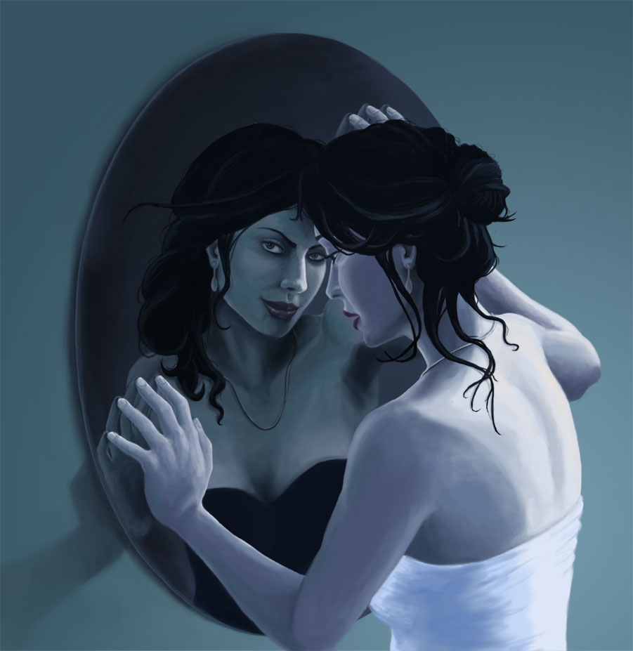
It still amazes me how you can go from a few very rough blobs of colour on the page to this. When you first start the tutorial, having seen what you are trying to paint, it seems impossible that you'll get anything even close to as good. It took a lot of work but was definitely worth the experience.
![]()