
Web Development➝Preserving the aspect ratio of general HTML elements
This article covers the concepts and techniques that can be used to preserve the aspect ratio of HTML elements while they resize to fit in their containing block.
Applying the CSS max-width: 100% and max-height: 100% to an element can help ensure it resizes with its containing block but will not
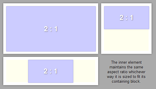
generally preserve the aspect ratio. The behaviour we're looking for should be as shown in the figure below.
We'll build up to a full solution in stages. First we see how this effect can be achieved for images - the technique is widely used and straightforward. Next we'll cover a reasonably well known technique that can be used for arbitrary HTML elements, the only problem with this technique being that it does not allow the child to resize with changes in height of its container. Finally we'll show how it's possible to achieve the full effect, preserving the aspect ratio of arbitrary HTML elements under both horizontal and vertical resizing.
Preserving the aspect ratio of images under horizontal and vertical resizing
Images are treated somewhat specially in CSS - they are an example of a replaced element. Simply put, a replaced element is one whose content is determined by an external resource, outside of the scope of CSS.[1] Other examples of replaced elements include form elements and plugins.
The size of non-replaced elements is usually determined by their surroundings and children. For example, a div will expand horizontally to fill its
containing block and shrink vertically to contain its children, unless width and height values other than auto are specified. Likewise, a span will
shrink horizontally and vertically to contain its text, or break across multiple lines when too long to avoid overflowing its container.
However, replaced elements may actually have intrinsic dimensions.[2][3][4]
Raster images will have a certain pixel width and height that is intrinsic to the image itself.
To render an image at its intrinsic size, all we need do is ensure the width and height of the image are not specified explicitly in the HTML of CSS. To do this we can either use auto for the image's width and height
in CSS, or we can leave off the width and height attributes on the img tag.
img {
    width: auto;
    height: auto;
}
<img src="picture.png" />
Now this may not seem very exciting, but it's actually quite useful if we are in a situation where the containing block may be arbitrarily resized. All we have to do is specify a maximum width and height on the image to ensure that it shrinks and grows with the container, and the nice thing is that due to the intrinsic dimensions of the image, the aspect ratio is preserved while resizing.
img {
    width: auto;
    height: auto;
    max-width: 100%;
    max-height: 100%;
}
Here's a little demo, try resizing horizontally and vertically and see how the image always fits without distortion.
Feed reader? View this demo on the site.

Note, if you were to explicitly specify a width for the image then vertical resizing will end up squashing the image away from its intrinsic aspect ratio. Likewise, specifying a height will cause horizontal resizing to squash the image.
There is actually a developing specification for enforcing this or other defined rezing behaviours for replaced elements; it goes under the name of
object-fit.[4] We won't be concerned with these other
resizing behaviours in this article.
Preserving aspect ratio of general elements under horizontal resizing
Can we achieve the same aspect ratio preserving effect for non-replaced elements? Is there any way to specify intrinsic dimensions for ordinary divs and spans for example? Well, according to the spec "In CSS 2.1 only replaced elements can come with intrinsic dimensions". But we obviously aren't going to give up that easily.
In fact, there is a reasonably well known trick that can get us most of the way, the only thing we'll be lacking is any form of resizing under changes in the containing box's height.
The method stems from the fact that when you specify a CSS padding in percentage
units, that percentage is calculated with respect to the containing blocks width, irrespective of whether it is a left/right or a top/bottom
padding. Thus, an otherwise empty div whose padding-top is set to 70% will generate a box whose height is 70% of its width.
This gives us our fixed aspect ratio.
.container-box {
    width: 400px;
    max-width: 100%;
    max-height: 100%;
}

.aspect-box {
    padding-top: 70%;
}
<div class="container-box">
    <div class="aspect-box">
    </div>
</div>
The next problem is how to get content inside this box. After all, it is entirely composed of padding, and adding content will break the aspect ratio. But there
is a trick that we can use. Absolute positioning is defined with respect to the padding box of the containing block. Thus we can make our aspect-box
a containing block for an absolutely positioned element, and enforce that this absolutely positioned element fills the size of the aspect-box. We do this
as follows:
.container-box {
    width: 400px;
    max-width: 100%;
    max-height: 100%;
}

.aspect-box {
    padding-top: 70%;
    position: relative
}

.content-box {
    position: absolute;
    top: 0;
    right: 0;
    bottom: 0;
    left: 0;
}
<div class="container-box">
    <div class="aspect-box" >
        <div class="content-box">
            Some content for which I want to maintain the aspect ratio.
        </div>
    </div>
</div>
Here's a little demo of this in action, go ahead and resize the container horizontally and vertically to see what happens:
Feed reader? View this demo on the site.
You'll note that horizontal resizing works perfectly, just like for the image. But vertical resizing does not, despite the fact that we specified a
max-height: 100% on the container-box. The reason for this lies in how CSS calculates dimensions when laying out elements
in normal flow; typically content is layed out horizontally first and the horizontal layout is then used to determine the vertical.
Thus resizing vertically cannot result in any recalculation of the width of the element.
Now this technique is reasonably well known, and may be sufficient for your needs. If that is so then great. But let's see if we can take this further and achieve the full resizing behaviour we had for the image.
Preserving the aspect ratio of general elements under horizontal and vertical resizing
At first we might think we can use an image, which we know resizes as we want, and attach some other, possibly absolute positioned element on top of the image, filling out the correct size? However, to be positioned with respect to the image an element would need to be a child of the image. But images have no children so we can't do this.
So, how about wrapping the image in some other element? Well we can try a few different types of wrapper.
If we wrap the image in a block element, e.g. a div, then we manage to preserve the horizontal resizing, but loose the vertical resizing, even if this div
has a style of max-height: 100%.
If we wrap the image in an inline-block element we end up loosing both horizontal and vertical resizing, horizontal resizing can be recovered with a max-width: 100% on
this element, but vertical resizing cannot be achieved in the same way.
This leaves us with a wrapping in an inline element, e.g. a span. If we do this then we still preserve the horizontal and vertical resizing of the image, but how can we
use the span? Well, we know the span will have it's left edge coincident with the left edge of the image and it's right edge coincident with the right edge of the image. Further
if we use vertical-align: bottom on the image we can ensure that the bottom edge of the span will coincide with the bottom edge of the image.
.wrapper {
    white-space: nowrap;
}

.image {
    width: auto;
    height: auto;
    max-width: 100%;
    max-height: 100%;
    vertical-align: bottom;
}
<span class="wrapper">
    <img class="image" src="picture.png" />
</span>
We can now use this span as the containing block of an absolutely positioned element whose left, right and bottom edges can be aligned with those of the span, and as such, those of the image.
.wrapper {
    position: relative;
    white-space: nowrap;
}

.image {
    width: auto;
    height: auto;
    max-width: 100%;
    max-height: 100%;
    vertical-align: bottom;
}

.positioner {
    position: absolute;
    bottom: 0;
    left: 0;
    right: 0;
}
<span class="wrapper">
    <img class="image" src="picture.png" /><div class="positioner">
    </div>
</span>
So far, so good. Now we need to align the top edge of the positioner div with that of the image. But before we do that, I'd like to show you how you can use this positioner to create nice labels for your images. Just give the positioner some specified height, a semi-transparent background colour, and ellipsis text-overflow, you get this:
Feed reader? View this demo on the site.
Well, that's nice. But I digress...
We need to align the top edge of the positioner with that of the image. We can't use the top edge of the wrapper span as this doesn't align with the top of the image. So instead, to achieve this we can make use
of our technique from earlier where we specified padding as a percentage of the containing block's width. We just need to know the aspect ratio of our
image, which in this case gives us a top padding of 70%.
Unfortunately Chrome doesn't seem to use the same containing block for our positioner as other browsers (that of the span), rather it goes out to the resizable container and calculates
percentage widths with respect to its width - as far as I can tell this is wrong. However, we can work around this problem, we just need to add an extra level of nesting to our heirarchy and put the padding on this inner div. We shall
refer to this div as the aspect box as before, but I've dropped the class name for reasons that will become apparent later.
.wrapper {
    position: relative;
    white-space: nowrap;
}

.image {
    width: auto;
    height: auto;
    max-width: 100%;
    max-height: 100%;
    vertical-align: bottom;
}

.positioner {
    position: absolute;
    bottom: 0;
    left: 0;
    right: 0;
}
<span class="wrapper">
    <img class="image" src="picture.png" /><div class="positioner">
        <div style="padding-top: 70%;"> <!-- padding-top must match the aspect ratio of your image = height / width * 100% -->
        </div>
    </div>
</span>
.wrapper {
    position: relative;
    white-space: nowrap;
}

.image {
    width: auto;
    height: auto;
    max-width: 100%;
    max-height: 100%;
    vertical-align: bottom;
}

.positioner {
    position: absolute;
    bottom: 0;
    left: 0;
    right: 0;
}

.content-box {
    position: absolute;
    top: 0;
    right: 0;
    bottom: 0;
    left: 0;
    white-space: normal;
}
<span class="wrapper">
    <img class="image" src="picture.png" /><div class="positioner">
        <div style="padding-top: 70%;"> <!-- padding-top must match the aspect ratio of your image = height / width * 100% -->
            <div class="content-box">
                Some content that I want to have the same aspect ratio as my cat image below.
            </div>
        </div>
    </div>
</span>
Feed reader? View this demo on the site.
So, we're pretty much there. The content box preserves it's aspect ratio as it's container resizes both vertically and horizontally and you can append whatever html content you desire to this box.
Browser support
Browser support for this solution is good, I've tested in Firefox 19, Chrome 25 and IE9. There is one caveat with getting this to work in Chrome: It appears that Chrome renders
everything before the image loads (whilst the size of the image is not yet known) and then subsequently doesn't perform a relayout after the image has loaded. This results in the
content box not being visible until some kind of resize forces a relayout. To work around this Chrome bug we can add a little JavaScript to the image's onload handler:
<img src="picture.png" class="image" onload="chromeFix(this);"/>
function chromeFix(el) {
    el.parentNode.style.display = 'none';
    el.parentNode.offsetWidth;
    el.parentNode.style.display = '';
}
Yuk! But unless anyone has a better way to get Chrome to work we'll have to live with it.
Optimizations
There is one more thing it would be nice to tidy up. We had to load an image of specific dimensions in order to get this to work. If we don't intend to use the image that's an extra server request we could've avoided.
Now one possible solution is to use a Data URI to embed the image directly in the page's markup. This avoids the server round trip, but does require us to generate the correct Data URIs for each specific size of element we want to create. There are a few possible ways we could do this. If we're serving up our pages via some back end processing language such as PHP we could put our logic for generating the image element in a simple function and call it when we need it, like this
<?php write_data_uri_transparent_image(400, 280); ?>
If we're just using static files we could either generate the Data URI's manually, or even generate the Data URI in JavaScript, a bit like how we did for JavaScript paint.
However, there is a much nicer, cleaner way: Let's use an inline SVG image. Unfortunately browser support seems limited to Firefox and Chrome Canary, but I live in hope that someone can make this method work cross browser. It works like this:
.wrapper {
    position: relative;
    white-space: nowrap;
}

.image {
    width: auto;
    height: auto;
    max-width: 100%;
    max-height: 100%;
    vertical-align: bottom;
}

.positioner {
    position: absolute;
    bottom: 0;
    left: 0;
    right: 0;
}

.content-box {
    position: absolute;
    top: 0;
    right: 0;
    bottom: 0;
    left: 0;
    white-space: normal;
}
<span class="wrapper">
    <svg width="400" height="280" class="image"></svg><div class="positioner">
        <div style="padding-top: 70%;">
            <div class="content-box">
                Some content that I want to have a fixed aspect ratio, yet to resize
                both horizontally and vertically as the container size is changed.
            </div>
        </div>
    </div>
</span>
Note how the width and height attributes specified on the svg element end up as intrinsic dimensions for the resulting replaced element.
This is in contrast to what happens with width and height attributes on an img element where the attributes are unrelated to the intrinsic
dimensions of the image. In effect, by using the svg element inline in the page we are able to edit the intrinsic properties of the element
directly in the html. This way both the aspect ratio (here 70%) specified in the top padding, and the intrinsic dimensions of the SVG image
are kept right next to each other, so we only have to look in this one place to change these.
Here is a demo of the SVG based solution, with a few bells and whistles added for fun:
Feed reader? View this demo on the site.
 Some content that I want to have a fixed aspect ratio, yet to resize
both horizontally and vertically as the container size is changed.
Some content that I want to have a fixed aspect ratio, yet to resize
both horizontally and vertically as the container size is changed.
This works correctly in Firefox 19 and Chrome Canary 27. The resize behaviour is weird in Chrome 25, but hopefully we'll get the Canaray behaviour before too long.
In IE 9 it seems the auto width and height styles completely replace the width and height specified on the svg element and as such it behaves
as though there are no intrinsic dimensions.
Summary
To wrap up, creating elements that preserve their aspect ratio while they resize can be achieved using various techniques. For images we just need to ensure the width
and height are set to auto. For more general elements we can use the percentage based padding technique if we are not concerned about vertical resizing. To get
the full horizontal and vertical resizing behaviour we can combine the image and padding techniques. This general solution has good browser support, but requires an image
of the desired aspect ratio in order to work; the more elegant solution using inline SVG has limited browser support.